Goodberry's: My Guilty Pleasure
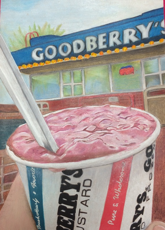
I love the composition of this piece. I think it turned out great. The custard looks very realistic. The shadows under the lip of the cup and on the spoon look very nice. I really appreciated having the large variety of prismacolor pencils to help me create the right shades of gray on the Goodberry's cup. The logo took me a looong time to get the perspective just right. I learned from my handful of pills piece that if the perspective of the logo isn't just perfect then the whole piece is torn apart. I found a white paint marker that I used to enhance the highlights . I liked that I was able to smear the marker so it wasn't too intense and it blended in nicely. The white gel pen came in handy for the small highlights, but the white paint pen really made the piece. The composition is very strong. Looking back now I wish I had done the background different. I would prefer it to be a little more blurred. Overall I love this piece and I consider it my favorite and the best piece in my portfolio. This piece works perfectly with my concentration because I am addicted to Goodberry's and I eat there a few times a week. I couldn't not include one of my most visited food spots.