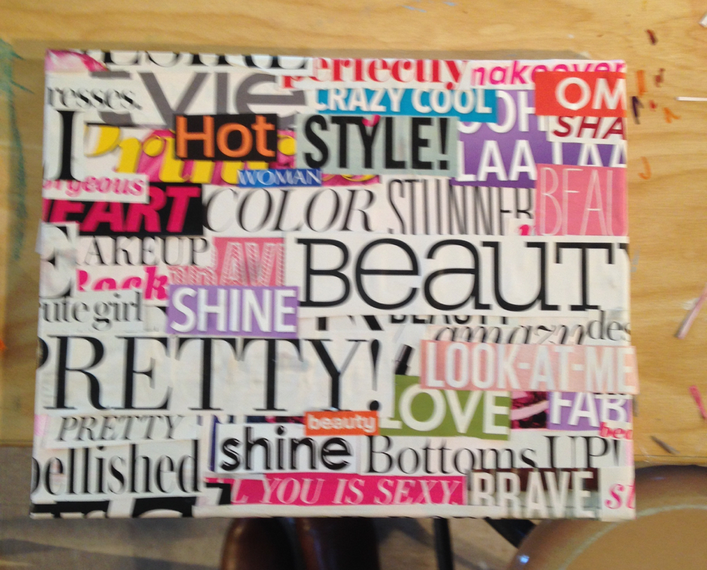
1st layer of words on the canvas
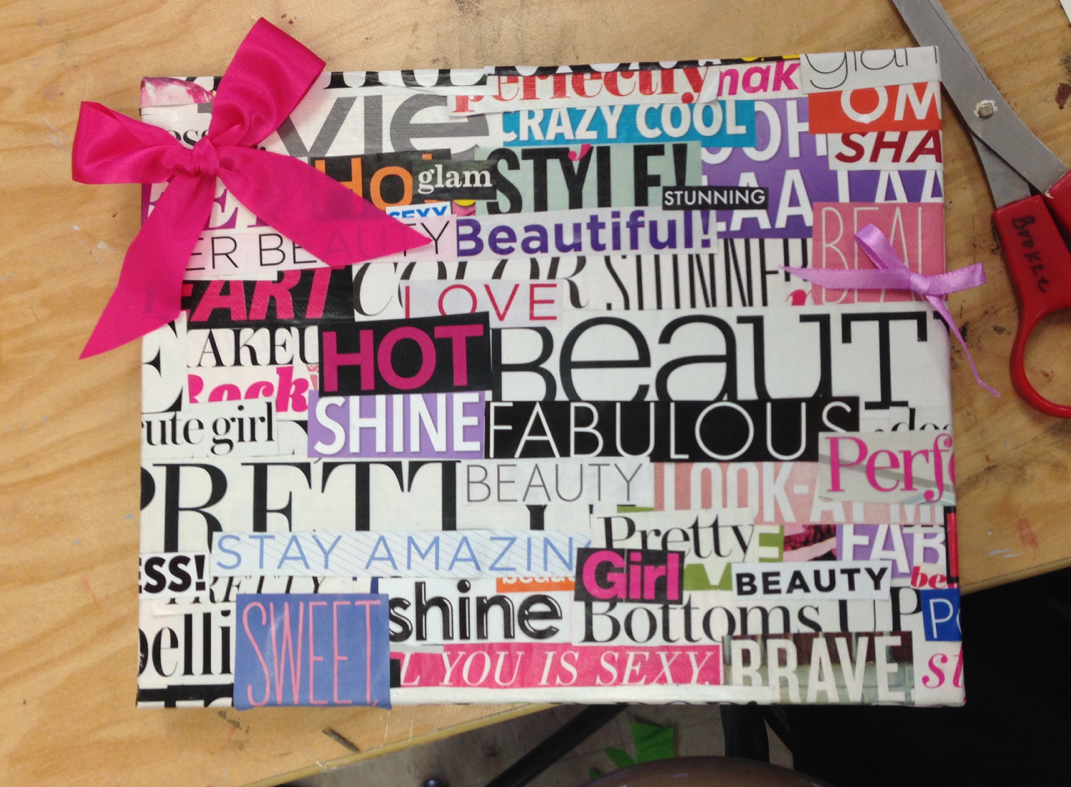
2 layer of misc. words and bows idea added
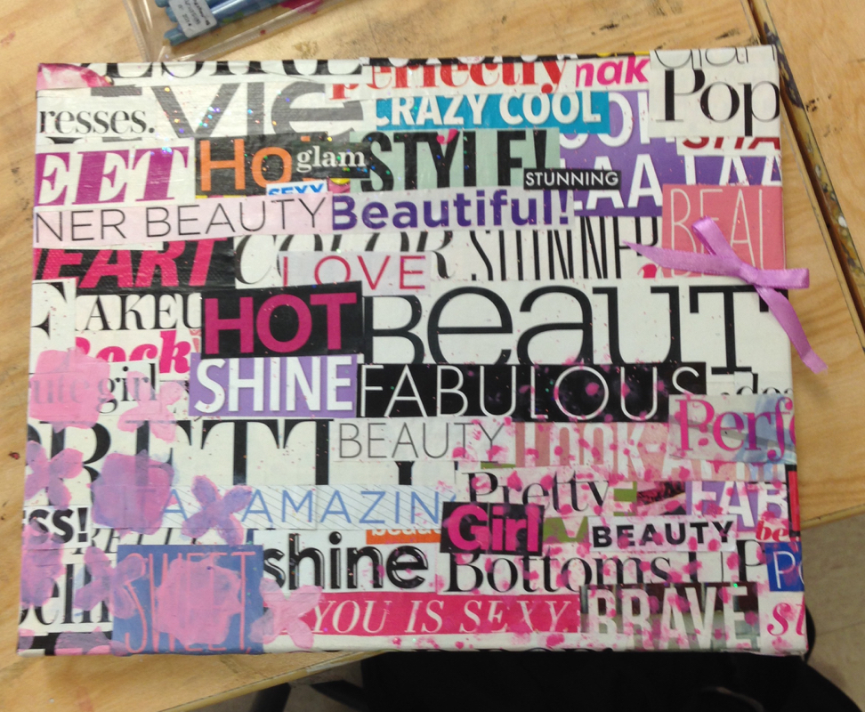
3rd layer of misc. words and paint idea added
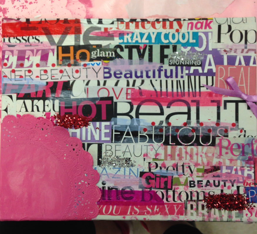
4th layer paint ideas covered with painted lace, glitter added, and tissue paper added as well
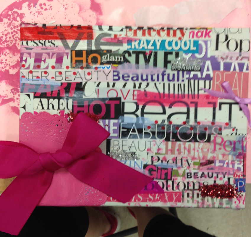
5th layer bows placed
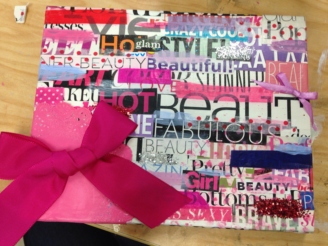
6th layer horizontal paint lines and more tissue paper added
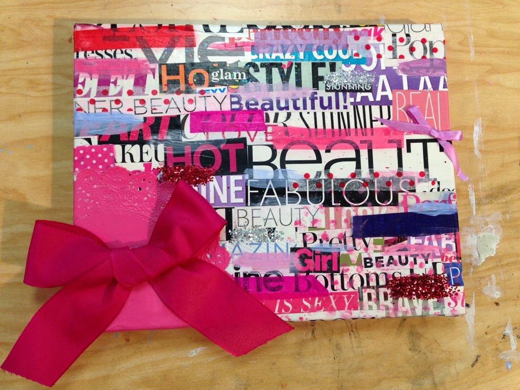
7th and final layer fabric strips added and project finished with light glitter coating
I really enjoyed making this collage project. My inspiration came from fashion magazines. When you look at my project it looks like a bunch of girly words cut out to look nice. But when I created this I intended the canvas to be women and how the media pushes them to be all the words on the canvas like "beautiful, flawless, fantastic, or sexy". All the mixed media on top of the words was supposed to be seen as make up and all the products or surgerys the media thinks women need to become perfect. When in reality the words or women's natural beauty gets covered up by all thw glitter, tissue paper and paint (makeup). I like how my project turned out. I thought I did a good job on adding many different mediums and I am very proud of my work.